Note
Click here to download the full example code
Plot the degree distributions of a graph#
import nngt
import nngt.plot as nplt

import matplotlib.pyplot as plt

plt.rcParams.update({
    'axes.edgecolor': 'grey', 'xtick.color': 'grey', 'ytick.color': 'grey',
    "figure.facecolor": (0, 0, 0, 0), "axes.facecolor": (0, 0, 0, 0),
    "axes.labelcolor": "grey", "text.color": "grey", "legend.facecolor": "none"
})


nngt.seed(0)
First, let’s create a scale-free network
g = nngt.generation.random_scale_free(2.1, 3.2, nodes=1000, avg_deg=100)
Plot the degree distribution
nplt.degree_distribution(g, deg_type=["in", "out"], show=True)
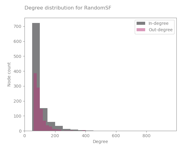
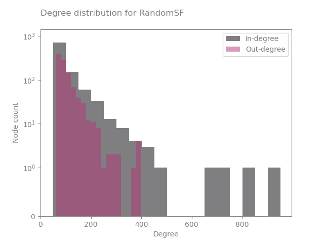
It’s not bad… but we don’t see much! Let’s move a more relevant scale
nplt.degree_distribution(g, deg_type=["in", "out"], logy=True, show=True)
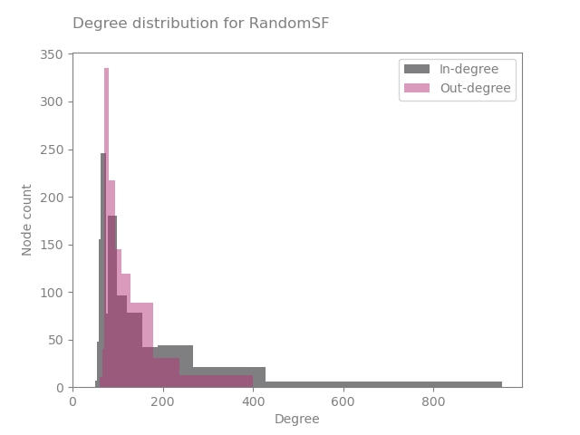
Or we can use Bayesian binning
nplt.degree_distribution(g, deg_type=["in", "out"], num_bins="bayes",
                         show=True)
Total running time of the script: ( 0 minutes 1.501 seconds)