Note
Go to the end to download the full example code.
Plot the betweenness distributions of a graph#
import nngt
import nngt.plot as nplt
from nngt.geometry import Shape

import matplotlib.pyplot as plt

plt.rcParams.update({
    'axes.edgecolor': 'grey', 'xtick.color': 'grey', 'ytick.color': 'grey',
    "figure.facecolor": (0, 0, 0, 0), "axes.facecolor": (0, 0, 0, 0),
    "axes.labelcolor": "grey", "text.color": "grey", "legend.facecolor": "none"
})


nngt.seed(0)
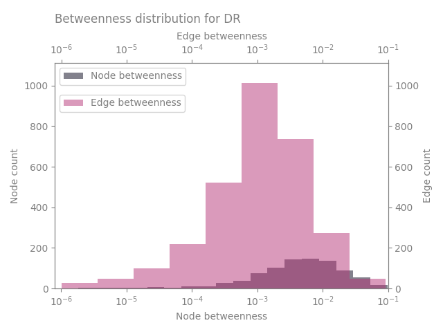
Let’s start by making a random exponential graph
shape = Shape.disk(100)

g = nngt.generation.distance_rule(5, shape=shape, nodes=1000, avg_deg=3)
then we can plot the betweenness
nplt.betweenness_distribution(g, logx=True, show=True, legend_location='left')
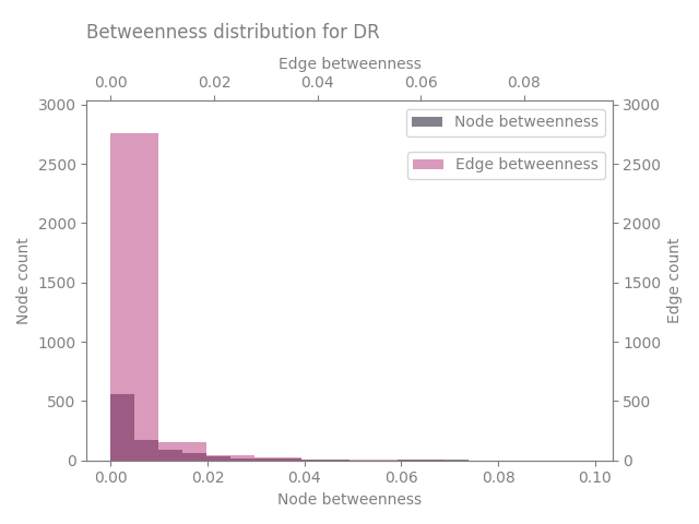
we can of course change various parameters and plot only the nodes
nplt.betweenness_distribution(g, logx=False, show=True)

nplt.betweenness_distribution(g, btype="node", num_nbins="auto", alpha=0.5,
                              show=True)

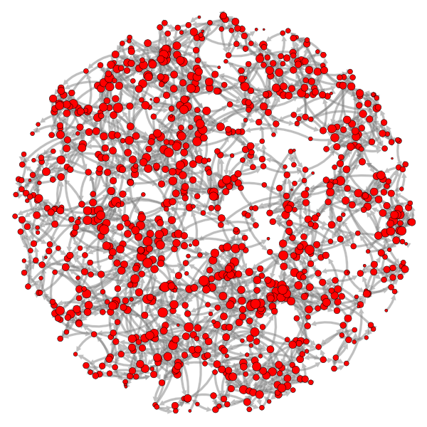
By the way, this is the graph we’re looking at
nplt.draw_network(g, max_nsize=5, max_esize=4, ecolor="grey", eborder_color="w",
                  curved_edges=True, show_environment=False, show=True)
Total running time of the script: (0 minutes 22.058 seconds)